

Uplift iOS Interview
The Guide is for YOU if
- You are preparing for an iOS interview and want to improve your skills and knowledge and looking to level up your interview game and land your dream job.
- You want to gain confidence and ease during iOS interviews by learning expert tips and curated strategies.
- You want access to a comprehensive list of iOS interview QA to practice and prepare.
The Complete Guide to SwiftUI Charts: Create Beautiful and Informative Data Visualizations.
Charts are an essential tool for displaying data in a way that is easy to understand and interpret. They allow users to quickly and easily identify trends, patterns, and outliers in the data. With the introduction of SwiftUI, creating charts on iOS has never been easier. SwiftUI is a powerful framework for building user interfaces on iOS, and one of the features it offers is the ability to create charts. Charts are an essential tool for displaying data in a way that is easy to understand and interpret. They allow users to quickly and easily understand trends, patterns, and outliers in the data. In this blog post, we will explore how to create charts in SwiftUI and how to customize them to fit your needs.
SwiftUI offers several built-in chart types, including bar charts, line charts, range charts, heat map or rectangle charts, and area charts. These charts can be easily created by using the corresponding views provided by the framework. SwiftUI Charts is adding visual appeal to your iOS App.
Mastering charts in SwiftUI involves understanding the various types of charts available, such as bar charts, line charts, and pie charts, and learning how to customize and style them to fit your needs. It also involves understanding how to work with data in SwiftUI, such as using data bindings and data sources to populate the charts with data. Additionally, learning how to use libraries such as ChartView and SwiftUICharts can be helpful in creating more advanced charts in SwiftUI.
Get ahead of the competition and ace your next iOS interview with expert-curated resources. Check out the collection of SwiftUI and Swift interview questions and answers, behavioral interview tips, and the popular custom layout contents. Plus, go through the new section for Engineering Manager to help you excel in your career!
Join my free Newsletter 🚀
Plot a Line Chart in SwiftUI
We’re going to take a look at how to use Swift Charts to create a simple line chart that shows the number of sells per category of products. We’ll start by defining a struct called Product that conforms to the Identifiable protocol, which means it has a unique identifier (id) property. The struct has two properties, category and numberOfSell, which are both integers.
Next, we’ll define our ContentView struct, which contains a view that displays a chart of product sales data. The ContentView struct has an array of Product structs called winterProducts, which contains sample data for nine different products.
import SwiftUI
import Charts

struct Product: Identifiable {
    let id = UUID()
    let category: Int
    let numberOfSell: Int
}

struct ContentView: View {
    var winterProducts: [Product] = [
        .init(category: 1, numberOfSell: 3),
        .init(category: 2, numberOfSell: 4),
        .init(category: 3, numberOfSell: 12),
        .init(category: 4, numberOfSell: 14),
        .init(category: 5, numberOfSell: 10),
        .init(category: 8, numberOfSell: 14),
        .init(category: 9, numberOfSell: 16),
        .init(category: 11, numberOfSell: 12),
        .init(category: 15, numberOfSell: 9)
    ]

    var body: some View {
        VStack(alignment: .leading) {
            Text("Product Overview")
                .font(.title)
                .fontWeight(.heavy)

            Chart(winterProducts) {
                LineMark(
                    x: .value("Category", $0.category),
                    y: .value("Number of sell", $0.numberOfSell)
                )
            }
            .frame(height: 300)
        }
        .padding()
    }
}
In the body property of the ContentView struct, we create a VStack (vertical stack) view that contains a Text view with the text “Product Overview” and a Chart view. The Chart view takes the winterProducts array as an argument and defines a LineMark mark to be used in the chart. The LineMark mark takes in two arguments, x and y that specify the data properties to be used in the chart, the properties of the Product struct are passed as argument to these properties. The x argument uses the value function to specify that the category property of the Product struct should be used as the x-axis value, and the y argument uses the value function to specify that the numberOfSell property of the Product struct should be used as the y-axis value.
We then set the Chart view’s frame to have a height of 300 pixels to set its size on the screen and add some padding to the VStack view to add some space around the chart and the text.

Swift Charts is a powerful tool for creating charts and visualizing data. One of the key features of Swift Charts is its ability to compose different types of marks on a single chart. This means that you can combine various types of marks, such as areas, bars, lines, points, rectangles, and rules, in a single chart to create a rich and informative visualization.
For example, you could use an AreaMark to show the overall trend of a dataset, while also using a BarMark to highlight specific data points, and a LineMark to show the average or median value. Additionally, you could use a PointMark to indicate specific data points that are of interest, and a RectangleMark to highlight a particular range of values. Finally, you could use a RuleMark to add reference lines or annotations to the chart to provide additional context or information.
Overall, the ability to compose different types of marks on a single chart in Swift Charts provides a great deal of flexibility and allows you to create a wide variety of visualizations that can effectively communicate your data.
Plot Multiple Lines in Line Chart
Let’s plot multiple lines and try to visualise product overview for multiple seasons. We will enhance the the Product struct with season and update the list accordingly.
import SwiftUI
import Charts

struct Product: Identifiable {
    let id = UUID()
    let category: Int
    let numberOfSell: Int
    let season: String
}

struct ContentView: View {
    var allSeasonProducts: [Product] = [
        .init(category: 1, numberOfSell: 3, season: "summer"),
        .init(category: 2, numberOfSell: 4, season: "winter"),
        .init(category: 3, numberOfSell: 12, season: "spring"),
        .init(category: 4, numberOfSell: 14, season: "summer"),
        .init(category: 5, numberOfSell: 10, season: "spring"),
        .init(category: 8, numberOfSell: 14, season: "summer"),
        .init(category: 9, numberOfSell: 16, season: "summer"),
        .init(category: 11, numberOfSell: 12, season: "spring"),
        .init(category: 15, numberOfSell: 9, season: "winter")
    ]

    var body: some View {
        VStack(alignment: .leading) {
            Text("Products Overview")
                .font(.title)
                .fontWeight(.heavy)

            Chart(allSeasonProducts) {
                LineMark(
                    x: .value("Category", $0.category),
                    y: .value("Number of sell", $0.numberOfSell)
                )
                .foregroundStyle(by: .value("Season", $0.season))

            }
            .frame(height: 300)
        }
        .padding()
    }
}
In Swift Charts, you have the option to plot multiple lines on a single chart. This can be achieved by either explicitly defining the series parameter when initializing a LineMark, or by applying the foregroundStyle(_:) modifiers. When the series parameter is specified, all LineMarks with the same series value will be rendered together as one line. If the series parameter is not specified, LineMarks with the same value plotted to foreground style and line style will be grouped together and plotted as separate lines.

Without any additional logic, we can implement a sophisticated graph. Thanks to the power of SwiftUI chart.
Plot an average value in a Line Chart using RuleMark
Annotating a chart with horizontal or vertically spanning rules is a useful tool for allowing viewers to quickly and easily compare values within a specific range to a constant value.
Let’s use RuleMark in the above chart and show the average sell as a red line. I am using map and reduce to calculate the average. Take a look at The Power of reduce in Swift, The power of map in Swift, Map, FlatMap, Filter, Reduce – High order functions in Swift
import SwiftUI
import Charts

struct Product: Identifiable {
    let id = UUID()
    let category: Int
    let numberOfSell: Int
    let season: String
}

struct ContentView: View {
    var allSeasonProducts: [Product] = [
        .init(category: 1, numberOfSell: 3, season: "summer"),
        .init(category: 2, numberOfSell: 4, season: "winter"),
        .init(category: 3, numberOfSell: 12, season: "spring"),
        .init(category: 4, numberOfSell: 14, season: "summer"),
        .init(category: 5, numberOfSell: 10, season: "spring"),
        .init(category: 8, numberOfSell: 14, season: "summer"),
        .init(category: 9, numberOfSell: 16, season: "summer"),
        .init(category: 11, numberOfSell: 12, season: "spring"),
        .init(category: 15, numberOfSell: 9, season: "winter")
    ]

    var body: some View {
        VStack(alignment: .leading) {
            Text("Products Overview")
                .font(.title)
                .fontWeight(.heavy)

            Chart(allSeasonProducts) {
                LineMark(
                    x: .value("Category", $0.category),
                    y: .value("Number of sell", $0.numberOfSell)
                )
                .foregroundStyle(by: .value("Season", $0.season))

                // Average line
                RuleMark(y: .value("Average Sell", (allSeasonProducts.map{$0.numberOfSell}).reduce(0, +)/allSeasonProducts.count))
                        .foregroundStyle(.red)

            }
            .frame(height: 300)
        }
        .padding()
    }
}

Plot a Point Chart in SwiftUI
The PointMark chart content allows for the creation of various point charts, including scatter plots. Scatter plots display the correlation between two numerical data properties. To construct a scatter plot, use the init(x:y:) method and supply labels, and plotted data as strings for both the x and y parameters. Let’s use the same product list and plot them using PointMark. Here, I have interchanged LineMark to PointMark.
......
  Chart(allSeasonProducts) {
     PointMark(
       x: .value("Category", $0.category),
       y: .value("Number of sell", $0.numberOfSell)
  )
  .foregroundStyle(by: .value("Season", $0.season))
......

You can also use both LineMark and PointMark inside the Chart View. The result would be a line chart with points. The foreground style modifier generates a color scale that assigns colors to each mark based on their value property. Alternatively, you can differentiate seasons by using different symbols and plotting the season property with the symbol(by:) modifier.
......
  Chart(allSeasonProducts) {
     PointMark(
       x: .value("Category", $0.category),
       y: .value("Number of sell", $0.numberOfSell)
  )
  .foregroundStyle(by: .value("Season", $0.season))
  .symbol(by: .value("Season", $0.season))
......

Plot a Bar Chart in SwiftUI
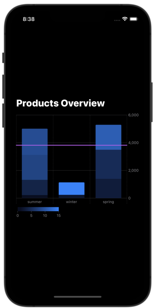
The BarMark chart content offers a wide variety of bar chart options to choose from. To create a simple and elegant vertical bar chart that plots categories on the x-axis and numbers on the y-axis, you can use the init(x:y:width:height:stacking:) method. For instance, you can use this to showcase the profit by season, which would be an excellent way to visualize the performance of each season. Let’s add profit in the product struct and update the product list accordingly.
We would like to present season data on the X-axis and profit on the Y-axis. Using RuleMark we will also present average profit throughout the seasons.
import SwiftUI
import Charts

struct Product: Identifiable {
    let id = UUID()
    let category: Int
    let numberOfSell: Int
    let season: String
    let profit: Double
}

struct ContentView: View {
    var allSeasonProducts: [Product] = [
        .init(category: 1, numberOfSell: 3, season: "summer", profit: 220),
        .init(category: 2, numberOfSell: 4, season: "winter", profit: 240),
        .init(category: 3, numberOfSell: 12, season: "spring", profit: 1400),
        .init(category: 4, numberOfSell: 14, season: "summer", profit: 1100),
        .init(category: 5, numberOfSell: 10, season: "spring", profit: 2100),
        .init(category: 8, numberOfSell: 14, season: "summer", profit: 1800),
        .init(category: 9, numberOfSell: 16, season: "summer", profit: 1900),
        .init(category: 11, numberOfSell: 12, season: "spring", profit: 1800),
        .init(category: 15, numberOfSell: 9, season: "winter", profit: 900)
    ]

    var body: some View {
        VStack(alignment: .leading) {
            Text("Products Overview")
                .font(.title)
                .fontWeight(.heavy)

            Chart(allSeasonProducts) {
                BarMark(
                    x: .value("Season", $0.season),
                    y: .value("Profit", $0.profit)
                )

                // Average profit
                RuleMark(y: .value("Average Profit", (allSeasonProducts.map{Int($0.profit)}).reduce(0, +)/Set(allSeasonProducts.map({$0.season})).count))
                        .foregroundStyle(.purple)

            }
            .frame(height: 300)
        }
        .padding()
    }
}
Plot a Stack Bar Chart in SwiftUI
BarkMark automatically stacks content when more than one bar maps to the same location. You can see this if you split the profit and season data up by category.
......
   BarMark(
     x: .value("Season", $0.season),
     y: .value("Profit", $0.profit)
  )
  .foregroundStyle(by: .value("Category", $0.category))
......
Plot an Area Chart in SwiftUI
Use AreaMark to display data as filled areas on a graph. To create a basic area mark chart, place a date or ordered string property on the x-axis and a numeric value on the y-axis. For instance, the following chart will show the relation between the category and profit.
......
AreaMark(
  x: .value("Category", $0.category),
  y: .value("Profit", $0.profit)
)
......

Plot a Heat Map/Rectangle Chart in SwiftUI
You can use the rectangle mark to create heat map charts or to annotate rectangular areas in a chart. The chart will display data about Internet users, including their age range and total hours spent on the internet.
First, let’s define a struct called “InternetUser” that will hold the data for each user. This struct conforms to the “Identifiable” protocol, which is required for the Charts framework to work with it. It also has three properties: “id”, “ageStart”, “ageEnd”, and “totalHourSpend”. “id” is a unique identifier generated by the UUID class and the other three properties hold the data for each user.
Next, we create a struct called “ContentView” that conforms to the “View” protocol. This struct will be responsible for displaying the chart and some text. Inside of this struct, we create an array of InternetUser objects and assign it to the “users” variable. The chart is created using the “Chart” function, which takes the array of InternetUser objects and a closure that defines how to create the chart.
The closure creates a “RectangleMark” for each InternetUser object. The mark is defined by four properties: xStart, xEnd, yStart, and yEnd. These properties are set to the age range and total hours spent on the internet for each user. The mark is also given an opacity of 0.2 to make it slightly transparent. The chart is also given a fixed height of 300. Finally, the whole view is given some padding to give it some space from the edges.
In conclusion, we have successfully created a chart in SwiftUI using the Charts framework. The chart displays data about Internet users in a clear and concise way.
import SwiftUI
import Charts

struct InternetUser: Identifiable {
    let id = UUID()
    let ageStart: Int
    let ageEnd: Int
    let totalHourSpend: Int
}

struct ContentView: View {
    let users: [InternetUser] = [
        InternetUser(ageStart: 4, ageEnd: 10, totalHourSpend: 2),
        InternetUser(ageStart: 10, ageEnd: 14, totalHourSpend: 4),
        InternetUser(ageStart: 15, ageEnd: 16, totalHourSpend: 5),
        InternetUser(ageStart: 16, ageEnd: 20, totalHourSpend: 9),
        InternetUser(ageStart: 21, ageEnd: 24, totalHourSpend: 11),
        InternetUser(ageStart: 24, ageEnd: 28, totalHourSpend: 7)
    ]

    var body: some View {
        VStack(alignment: .leading) {
            Text("Internet User Overview")
                .font(.title)
                .fontWeight(.heavy)

            Chart(users) { user in
                RectangleMark(
                    xStart: .value("Age Start", user.ageStart + user.totalHourSpend),
                    xEnd: .value("Age Start", user.ageStart - user.totalHourSpend),
                    yStart: .value("Age End", user.ageEnd + user.totalHourSpend),
                    yEnd: .value("Age End", user.ageEnd - user.totalHourSpend)
                )
                .opacity(0.2)
            }
            .frame(height: 300)
        }
        .padding()
    }
}
Plot an Interval Bar/Gantt Chart in SwiftUI
You can use BarMark to represent intervals. The example below displays a Gantt chart by plotting the start and end properties to age range to x and the totalHourSpend property to y positions:
import SwiftUI
import Charts
struct InternetUser: Identifiable {
    let id = UUID()
    let ageStart: Int
    let ageEnd: Int
    let totalHourSpend: Int
}

struct ContentView: View {
    let users: [InternetUser] = [
        InternetUser(ageStart: 4, ageEnd: 10, totalHourSpend: 2),
        InternetUser(ageStart: 10, ageEnd: 14, totalHourSpend: 4),
        InternetUser(ageStart: 15, ageEnd: 16, totalHourSpend: 5),
        InternetUser(ageStart: 16, ageEnd: 20, totalHourSpend: 9),
        InternetUser(ageStart: 21, ageEnd: 24, totalHourSpend: 11),
        InternetUser(ageStart: 24, ageEnd: 28, totalHourSpend: 7)
    ]

    var body: some View {
        VStack(alignment: .leading) {
            Text("Internet User Overview")
                .font(.title)
                .fontWeight(.heavy)
            Chart(users) {
                BarMark(
                    xStart: .value("Age range start", $0.ageStart),
                    xEnd: .value("Age range end", $0.ageEnd),
                    y: .value("Hours spend", $0.totalHourSpend)
                )
            }
            .frame(height: 300)
        }
        .padding()
    }
}

Plot a Range Chart in SwiftUI
Rule marks can also be used to generate a Range chart. The above result can be achieved using RuleMark as well.
......
RuleMark(
  xStart: .value("Age range start", $0.ageStart),
  xEnd: .value("Age range end", $0.ageEnd),
  y: .value("Hours spend", $0.totalHourSpend)
)
......
Read more from Apple Documentation.
In this post, we had the wonderful opportunity to learn about the Swift Charts framework. The framework is incredibly convenient, as it offers a plethora of default options that make chart building a breeze. Additionally, each chart we create is fully accessible and comes equipped with a legend, axis, shape, and correctly scaled plotting area.
In the future posts, we’ll dive deeper into the various customization options available within the framework. I sincerely hope you found today’s post enjoyable. If you have any questions or comments, please don’t hesitate to reach out to me on LinkedIn or Twitter. I truly appreciate you taking the time to read this post, and I look forward to sharing more with you.
✍️ Written by Ishtiak Ahmed
👉 Follow me on X ● LinkedIn
Get Ready to Shine: Mastering the iOS Interview
Enjoying the articles? Get the inside scoop by subscribing to my newsletter.
Get access to exclusive iOS development tips, tricks, and insights when you subscribe to my newsletter. You'll also receive links to new articles, app development ideas, and an interview preparation mini book.