
Uplift iOS Interview
The Guide is for YOU if
- You are preparing for an iOS interview and want to improve your skills and knowledge and looking to level up your interview game and land your dream job.
- You want to gain confidence and ease during iOS interviews by learning expert tips and curated strategies.
- You want access to a comprehensive list of iOS interview QA to practice and prepare.
SF Symbols is a set of over 4000 configurable vector-based symbols provided by Apple for use in iOS, iPadOS, and macOS apps. These symbols are designed to be highly legible and consistent with Apple’s design guidelines, making it easy for developers to create visually appealing and user-friendly interfaces.
SF Symbols is a valuable tool for developers as it allows for the incorporation of a vast and expanding selection of icons within apps. With each passing year, the collection of icons grows larger with the addition of new symbols and the enhancement of existing features such as multicolor rendering in iOS 14 and complete layer control in iOS 15.
These icons are designed to be highly customizable and can be used in both Swift and SwiftUI. In this blog post, we will explore the benefits of using SF Symbols in your iOS apps, and how you can incorporate them into your Swift and SwiftUI projects. In this blog post, we will cover the basics of using SF Symbols in your iOS apps, including how to customize the appearance, how to use it in SwiftUI, and how to take advantage of the benefits of using SF Symbols. Whether you’re a seasoned iOS developer or just getting started, this guide will provide you with the knowledge you need to start using SF Symbols in your own projects. This article will guide you through the process of utilizing SF Symbols in your projects, with examples provided for both SwiftUI and UIKit.
How to use SF symbol?
Using SF Symbols in your app is straightforward. First, you’ll need to make sure that your app is running on a version of iOS, iPadOS, or macOS that supports SF Symbols. Once that’s done, you can use the symbols in your app by referencing them by name in your code or interface builder.
For example, to use the “heart” symbol in a SwiftUI app, you would use the following code:
// SwiftUI
Image(systemName: "heart.fill")
Apple has made it incredibly simple to incorporate SF symbols into your iOS app. The process is straightforward:
- Browse and locate the desired icon within the SF Symbols Mac app.
- Use the keyboard shortcut ⇧⌘C to copy the symbol’s name. Eg. “heart.fill”
- Utilize the symbol’s name within the UIImage(systemName: “heart.fill”) or Image(systemName: “heart.fill”).
From which version apple supports SF Symbols?
SF Symbols are supported on a variety of platforms including iOS 13 and later, watchOS 6 and later, macOS 11 and later, and tvOS 13 and later. However, it’s important to note that the availability of individual symbols and features may vary depending on the system version. If you need to use SF Symbols on older OS versions, you can export them as SVG files and include them in your app. However, this approach won’t allow you to take advantage of features like different rendering modes. Additionally, SF Symbols are included in the San Francisco system font, so you can also use them in a Mac app, but be aware that license agreements apply.
Benefits of using SF Symbols
One of the key benefits of using SF Symbols is that they are designed to be consistent with the system icons, which helps to create a cohesive user experience. There are several benefits to using SF Symbols in your iOS app:
- Consistency: SF Symbols are designed to be consistent with the system icons, which helps to create a cohesive user experience.
- Dynamic Type: SF Symbols support Dynamic Type, which means that the icons will automatically adjust to the user’s preferred text size.
- Customizability: SF Symbols can be easily customized with different colors, weights, and scales.
- Large library: SF Symbols provide a large library of icons that can be used in various context to help users quickly understand the meaning of the icon.
- Accessibility: SF Symbols are designed with accessibility in mind, so they are easy to understand and use for people with disabilities.
- Platform support: SF Symbols are supported on multiple platforms including iOS, watchOS, macOS, and tvOS, which means you can use the same icons across different devices.
By using SF Symbols in your app, you can create a more consistent and user-friendly interface that is easily customizable and accessible to all users.
Is SF Symbols free?
Yes.
Are SF Symbols open source?
SF symbols are not open source they are mostly limited to creating icons for apps running on Apple’s iOS, iPadOS, macOS, and tvOS operating systems
Can I use SF Symbols in my app icon? or Can I use the symbols for another purpose?
You can not use SF symbols in app icons, logos, or any other trademarked use. Take a look at the license agreements from apple.
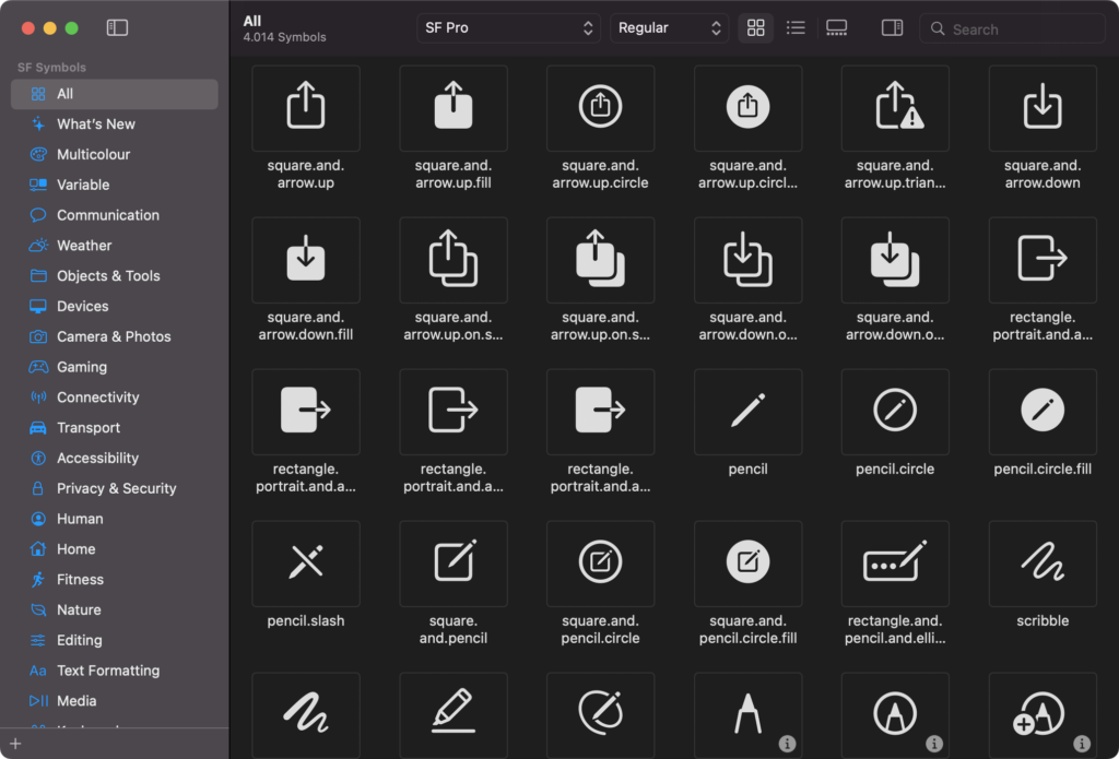
How do I see all SF Symbols?
As a helpful tip, the most efficient method for browsing the list of symbols is through the use of Apple’s SF Symbols app, which is available at no cost.
In UIKit, you need to use UIImage and place it in a UIImageView:
// UIKit
let image = UIImage(systemName: "heart.fill")
let imageView = UIImageView(image: image)
Get ahead of the competition and ace your next iOS interview with expert-curated resources. Check out the collection of SwiftUI and Swift interview questions and answers, behavioral interview tips, and the popular custom layout contents. Plus, go through the new section for Engineering Manager to help you excel in your career!
Join my free Newsletter 🚀
How to see all the SF symbols on the web/online?
You can see all the symbols at sfsymbols.com
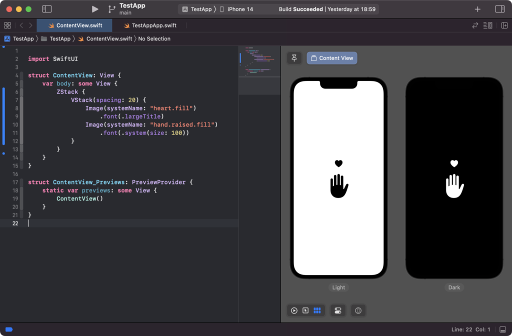
Change the size of SF Symbol
In SwifUI
One of the key benefits of SF Symbols is that they are completely vector-based graphics, which means that you can adjust their size without any loss of quality. This feature also applies to the built-in Dynamic Type sizes, as SF Symbols will automatically adapt to match other text in your user interface.
In SwiftUI, adjusting the size of an SF Symbol is done using the font() modifier with a built-in text style or a custom font size. For example:
struct ContentView: View {
    var body: some View {
        ZStack {
            VStack(spacing: 20) {
                Image(systemName: "heart.fill")
                    .font(.largeTitle)
                Image(systemName: "hand.raised.fill")
                    .font(.system(size: 100))
            }
        }
    }
}
In UIKit
You need UIImage.SymbolConfiguration for changing the size in UIKit.
let config = UIImage.SymbolConfiguration(textStyle: .largeTitle)
let image = UIImage(systemName: "heart.fill", withConfiguration: config)

let config = UIImage.SymbolConfiguration(pointSize: 100)
let image = UIImage(systemName: "hand.raised.fill", withConfiguration: config)
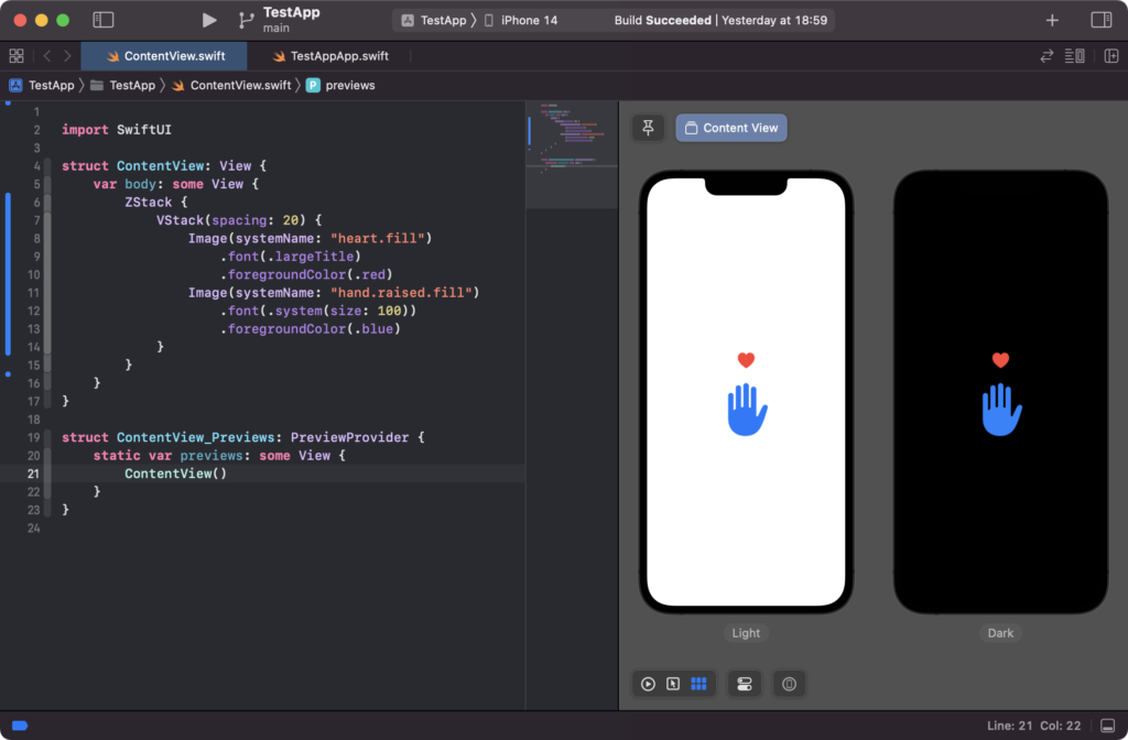
Change the color of SF Symbol
SF Symbols are rendered in a default color, depending on the layout system you are using. In SwiftUI, the default font color is used, while in UIKit, the default tint color is used. Regardless of the layout system, it is possible to customize the color of the icon in various ways.
To change the entire color of an SF Symbol using SwiftUI, you can use the foregroundColor() modifier like this:
In SwifUI
Image(systemName: "heart")
.foregroundColor(.red)
In UIKit
let symbol = UIImage(systemName: "heart")
symbol.withTintColor(.red)
Scale SF Symbol
In the previous example, you have learned how to attach custom font sizes to SF Symbols, which allows them to blend seamlessly into your text. Another way to customize the appearance of SF Symbols is to scale them independently of the font size. This offers even more precise control over how they appear in your user interface.
In SwifUI
Image(systemName: "heart")
    .imageScale(.large)
In UIKit
In UIKit, this can be achieved by using the scale initializer with another symbol configuration.
let symbol = UIImage.SymbolConfiguration(scale: .large)
let image = UIImage(systemName: "heart", withConfiguration: symbol)
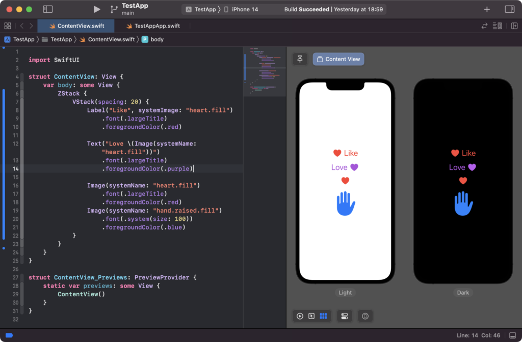
Add Text with SF Symbol
In SwifUI
Label("Like", systemImage: "heart.fill")
      .font(.largeTitle)
      .foregroundColor(.red)

Text("Love \(Image(systemName: "heart.fill"))")
      .font(.largeTitle)
      .foregroundColor(.purple)
In UIKit
I’ve combined the image and text string into a single NSMutableAttributedString and then set the label’s attributed text to that string. I’ve also added bounds to the attachment, it will set the size of the image, this is important to make sure the image is displayed in the correct size. Also, I’ve used sizeToFit() method on the label to automatically adjust the label’s size to fit its text.
It makes the code more readable, also it’s good practice to use sizeToFit() method to adjust the size of the label instead of hardcoding the size.
let image = UIImage(systemName: "heart")
let attachment = NSTextAttachment()
attachment.image = image

let imageString = NSAttributedString(attachment: attachment)
let textString = NSAttributedString(string: "Please try again")
let finalString = NSMutableAttributedString()
finalString.append(imageString)
finalString.append(textString)

let label = UILabel()
label.attributedText = finalString
label.sizeToFit()
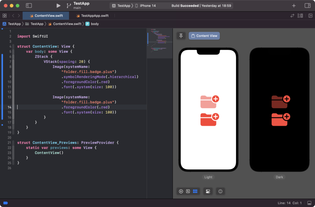
Hierarchical SF Symbols
In order to render hierarchical SF Symbols in iOS 15 and later, you can use the Image view in SwiftUI and set the symbolRenderingMode to .hierarchical. You can also set the foregroundColor to the desired color.
In Swift
struct ContentView: View {
    var body: some View {
        ZStack {
            VStack(spacing: 20) {
                Image(systemName: "folder.fill.badge.plus")
                    .symbolRenderingMode(.hierarchical)
                    .foregroundColor(.red)
                    .font(.system(size: 100))

                Image(systemName: "folder.fill.badge.plus")
                    .foregroundColor(.red)
                    .font(.system(size: 100))
            }
        }
    }
}
In UIKit
let symbol = UIImage.SymbolConfiguration(hierarchicalColor: .red)
let image = UIImage(systemName: "folder.fill.badge.plus", withConfiguration: symbol)
Toggle SF Symbol with SF Symbol variants
In iOS 15 and later, certain SF Symbols have multiple variations that can be activated by name, such as “none“, “circle“, “fill“, “rectangle“, “slash”, or “square”. In UIKit, you have to specify the variant name in the symbol string, such as “heart.fill”. However, in SwiftUI, there is a symbolVariant() modifier that simplifies the process of activating these variants.
For example
In Swift
Image(systemName: "heart")
    .symbolVariant(.fill)
Image(systemName: "heart")
    .symbolVariant(.rectangle)
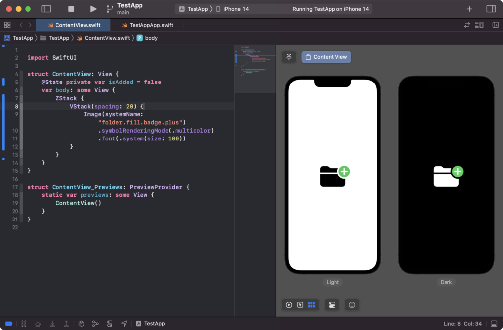
Add a toggle condition
import SwiftUI

struct ContentView: View {
    @State private var isAdded = false
    var body: some View {
        ZStack {
            VStack(spacing: 20) {
                Image(systemName: "heart")
                    .symbolVariant(isAdded ? .fill : .none)
                    .symbolRenderingMode(.hierarchical)
                    .foregroundColor(.red)
                    .font(.system(size: 100))
                    .onTapGesture {
                        isAdded.toggle()
                    }
            }
        }
    }
}

 Image(systemName: "folder.fill.badge.plus")
                    .symbolRenderingMode(.multicolor)
                    .font(.system(size: 100))
Multicolor SF Symbols
In iOS 14 and later, some SF Symbols are provided with a multicolor option. In SwiftUI, you can render these multicolor SF Symbols by using the Image view and setting the symbolRenderingMode.
In SwiftUI
Image(systemName: "folder.fill.badge.plus")
   .symbolRenderingMode(.multicolor)
   .font(.system(size: 100))
In UIKit
let config =  UIImage.SymbolConfiguration.configurationPreferringMulticolor()
let image = UIImage(systemName: "folder.fill.badge.plus", withConfiguration: config)
Exporting a symbol
If you are looking to use a specific symbol in a place where the font cannot be used, the SF Symbols Mac app offers the option to export any symbol as an SVG file through the File -> Export Symbol… feature. This allows for greater flexibility in where the symbol can be used, but it is important to be aware of any license agreements that may apply.
Creating a collection of symbols
The 3.0 version of the SF Symbols Mac app allows users to create a collection of symbols, making it easier to organize and keep track of the symbols being used in an app. This can be a valuable tool for ensuring all necessary symbols are readily available.
Compatibility – Using SF Symbols in iOS 12 and below
SF Symbols cannot be used directly on iOS 12 and below as it can on iOS 13 and later. However, if you wish to use any of the symbols on these older versions of iOS, you can export them from the SF Symbols Mac app and import them as regular assets in your Asset Catalog. This allows for the use of the symbols, but some features such as different rendering modes may not be available.
Resources
✍️ Written by Ishtiak Ahmed
👉 Follow me on X ● LinkedIn
Get Ready to Shine: Mastering the iOS Interview
Enjoying the articles? Get the inside scoop by subscribing to my newsletter.
Get access to exclusive iOS development tips, tricks, and insights when you subscribe to my newsletter. You'll also receive links to new articles, app development ideas, and an interview preparation mini book.