
Uplift iOS Interview
The Guide is for YOU if
- You are preparing for an iOS interview and want to improve your skills and knowledge and looking to level up your interview game and land your dream job.
- You want to gain confidence and ease during iOS interviews by learning expert tips and curated strategies.
- You want access to a comprehensive list of iOS interview QA to practice and prepare.
To create a simple color picker in SwiftUI, you can use a Picker control and bind it to an array of Color values. Here is an example of how you might do this:
struct CustomColorPicker: View {
    @Binding var selectedColor: Color

    var body: some View {
        Picker("Color", selection: $selectedColor) {
            ForEach([Color.red, .blue, .green, .gray, .brown], id: \.self) { color in
                Text(color.description.capitalized)
                    .tag(color)
                    .foregroundColor(color)
            }
        }
        .pickerStyle(.wheel)
    }
}
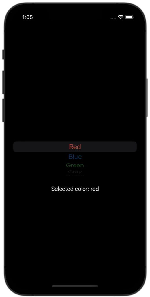
This creates a picker control with a segmented style, and populates it with a list of all the available Color cases. The selectedColor binding is used to keep track of the currently selected color, and the description property of each Color is used as the label for the corresponding segment.
To use this color picker in your code, you would need to create a binding to a state variable that will hold the selected color, and pass it to the selectedColor property of the ColorPicker.
For example:
struct ContentView: View {
    @State private var selectedColor = Color.red

    var body: some View {
        VStack {
            CustomColorPicker(selectedColor: $selectedColor)
            Text("Selected color: \(selectedColor.description)")
        }
    }
}
This will create a color picker with a list of all the available Color cases, and display the selected color below the picker.
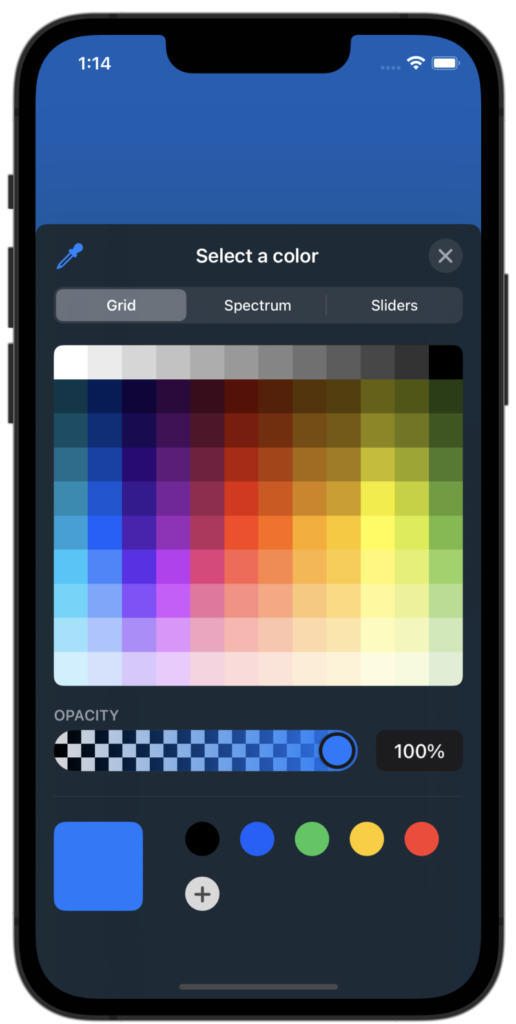
You can use the native SwiftUI ColorPicker control that allows the user to select a color.
struct ContentView: View {
    @State private var selectedColor = Color.blue

    var body: some View {
        ZStack {
            ColorPicker("Select a color", selection: $selectedColor)
                .padding()
        }
        .frame(maxWidth: .infinity, maxHeight: .infinity)
        .background(selectedColor)
    }
}
Let me create another version of the custom color picker. To create a custom color picker in SwiftUI, you can use a ScrollView or VStack to lay out a list of Button or Circle views, each with a different color. Here is an example of how you might do this:
struct CustomColorPicker: View {
    @Binding var selectedColor: Color
    let colors: [Color] = [.purple,
                           .red,
                           .orange,
                           .yellow,
                           .green,
                           .blue]
    var body: some View {
        ScrollView(.horizontal, showsIndicators: false) {
            HStack(spacing: 20) {
                ForEach(colors, id: \.self) { color in
                    Button(action: {
                        self.selectedColor = color
                    }) {
                        Circle()
                            .fill(color)
                            .frame(width: 50, height: 50)
                            .overlay(
                                Circle()
                                    .stroke(Color.white, lineWidth: self.selectedColor == color ? 3 : 0)
                            )
                    }
                }
            }
            .padding()
        }
    }
}

struct ContentView: View {
    @State private var selectedColor = Color.blue

    var body: some View {
        ZStack {
            CustomColorPicker(selectedColor: $selectedColor)
                .padding()
        }
        .frame(maxWidth: .infinity, maxHeight: .infinity)
    }
}
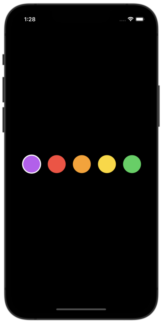
This creates a horizontal scroll view with a row of buttons, each with a circular shape and a different color. When a button is tapped, the selectedColor binding is updated to the corresponding color. The buttons also have an overlaid circle with a black stroke that is shown or hidden based on whether the button’s color is the currently selected color.
To use this color picker in your code, you would need to create a binding to a state variable that will hold the selected color, and pass it to the selectedColor property of the ColorPicker.
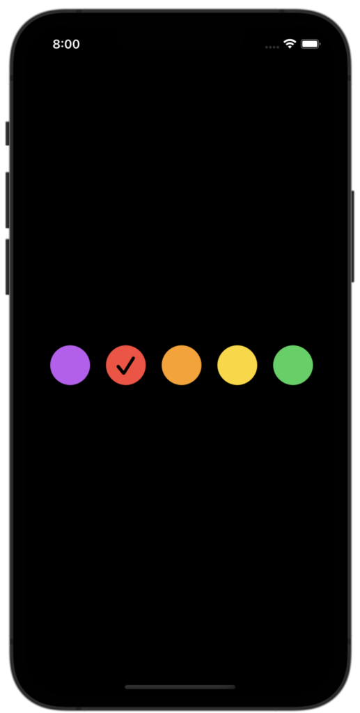
However, we can create another variation of color picker with a tick mark by using image.
struct CustomColorPicker: View {
    @Binding var selectedColor: Color
    let colors: [Color] = [.purple,
                           .red,
                           .orange,
                           .yellow,
                           .green,
                           .blue]
    var body: some View {
        ScrollView(.horizontal, showsIndicators: false) {
            HStack(spacing: 20) {
                ForEach(colors, id: \.self) { color in
                    Button(action: {
                        self.selectedColor = color
                    }) {
                        Image(systemName: self.selectedColor == color ? "checkmark.circle.fill" : "circle.fill")
                            .resizable()
                            .frame(width: 50, height: 50)
                    }.accentColor(color)
                }
            }
            .padding()
        }
    }
}

struct ContentView: View {
    @State private var selectedColor = Color.red

    var body: some View {
        ZStack {
            CustomColorPicker(selectedColor: $selectedColor)
                .padding()
        }
        .frame(maxWidth: .infinity, maxHeight: .infinity)
    }
}
✍️ Written by Ishtiak Ahmed
👉 Follow me on X ● LinkedIn
Get Ready to Shine: Mastering the iOS Interview
Enjoying the articles? Get the inside scoop by subscribing to my newsletter.
Get access to exclusive iOS development tips, tricks, and insights when you subscribe to my newsletter. You'll also receive links to new articles, app development ideas, and an interview preparation mini book.