Uplift iOS Interview
The Guide is for YOU if
- You are preparing for an iOS interview and want to improve your skills and knowledge and looking to level up your interview game and land your dream job.
- You want to gain confidence and ease during iOS interviews by learning expert tips and curated strategies.
- You want access to a comprehensive list of iOS interview QA to practice and prepare.
Activity rings are a feature of the Apple Watch that track a user’s physical activity throughout the day. There are three rings: one for Move, one for Exercise, and one for Stand. I will create a basic custom activity ring for the beginner and go deep by implementing multi rings.
In this blog post about creating an Activity ring in SwiftUI will cover the following topics:
- Setting up the basic structure of the ring using the
ZStackandCircleviews. - Creating a custom view modifier to apply the ring’s appearance, such as color and thickness, to the
Circleview. - Using the
animation()method to create an animation for the ring’s progress and a@Statevariable to track and update the progress. - Using the state variable and updating the ring’s progess accordingly.
- Adding interactivity to the ring, such as the ability to tap or long press and hold to increase the progress.
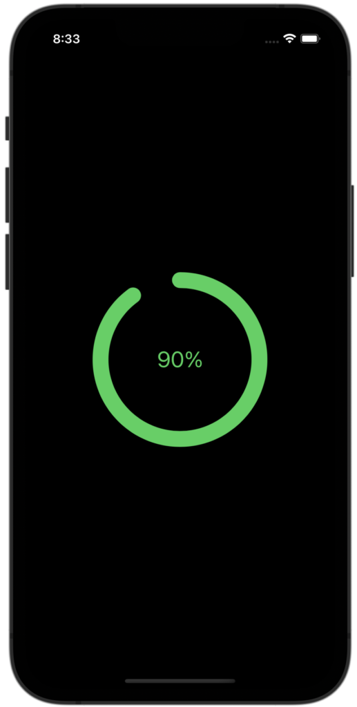
A Super Basic Custom Activity Ring
Here is an example of how you might create an activity ring in SwiftUI:
struct BasicActivityRing: View {
    @State private var progress: CGFloat = 0.9

    var body: some View {
        ZStack {
            Circle()
                .trim(from: 0, to: progress)
                .stroke(Color.green, style: StrokeStyle(lineWidth: 20, lineCap: .round))
                .frame(width: 200, height: 200)
                .rotationEffect(.degrees(-90))
                .animation(.linear)

            Text("\(Int(progress * 100))%")
                .font(.title)
                .foregroundColor(.green)
        }
        .onTapGesture {
            withAnimation {
                self.progress += 0.01
                if self.progress > 1.01 {
                    self.progress = 0
                }
            }
        }
    }
}
This creates a ring-shaped view using the Circle view, with the trim(from:to:) modifier used to create the appearance of a ring with filled and unfilled sections. The stroke modifier is used to apply a green color and a line width of 20 to the ring. The frame modifier is used to set the size of the ring to 200×200 pixels. The rotationEffect is used to rotate the ring -90 degrees to start the animation from the top.
The Text view is used to display the current progress as a percentage, and the onTapGesture is used to increment the progress by 0.1 on each tap and resets the progress back to zero when it reaches 1.
You can customize this code to match your desired design and desired data.
FastForwardActivityRing: Fast forward with Long press and hold
struct FastForwardActivityRing: View {
    @State private var progress: CGFloat = 0.9
    @State private var timer: Timer?
    @State private var isLongPressAndHold = false

    var body: some View {
        ZStack {
            Circle()
                .trim(from: 0, to: progress)
                .stroke(Color.green, style: StrokeStyle(lineWidth: 20, lineCap: .round))
                .frame(width: 200, height: 200)
                .rotationEffect(.degrees(-90))
                .animation(.linear)

            Text("\(Int(progress * 100))%")
                .font(.title)
                .foregroundColor(.green)
        }
        .onTapGesture {
            withAnimation {
                if isLongPressAndHold {
                    isLongPressAndHold.toggle()
                    timer?.invalidate()
                } else {
                    progress += 0.01
                    if progress > 1.01 {
                        progress = 0
                    }
                }
            }
        }
        .simultaneousGesture(LongPressGesture(minimumDuration: 0.2).onEnded { _ in
            isLongPressAndHold = true
            timer = Timer.scheduledTimer(withTimeInterval: 0.1, repeats: true, block: { _ in
                progress += 0.01
                if progress > 1.01 {
                    progress = 0
                    isLongPressAndHold.toggle()
                    timer?.invalidate()
                }
            })
        })
    }
}
The view has two gesture recognizers to implement press and hold behaviour.
- A
onTapGesturethat increases the progress by 0.01 when the view is tapped. If the user is currently performing a long press gesture, the gesture recognizer will stop the timer and reset theisLongPressAndHoldflag. - A
LongPressGesturethat starts a timer when the user performs a long press gesture. The timer increases the progress by 0.01 every 0.1 seconds until the progress reaches 100%. When this happens, the timer is invalidated and theisLongPressAndHoldflag is reset.
The code creates a circular progress indicator that can be incremented by tapping on the view or by holding down on the view to increment the progress continuously.
✍️ Written by Ishtiak Ahmed
👉 Follow me on X ● LinkedIn
Get Ready to Shine: Mastering the iOS Interview
Enjoying the articles? Get the inside scoop by subscribing to my newsletter.
Get access to exclusive iOS development tips, tricks, and insights when you subscribe to my newsletter. You'll also receive links to new articles, app development ideas, and an interview preparation mini book.