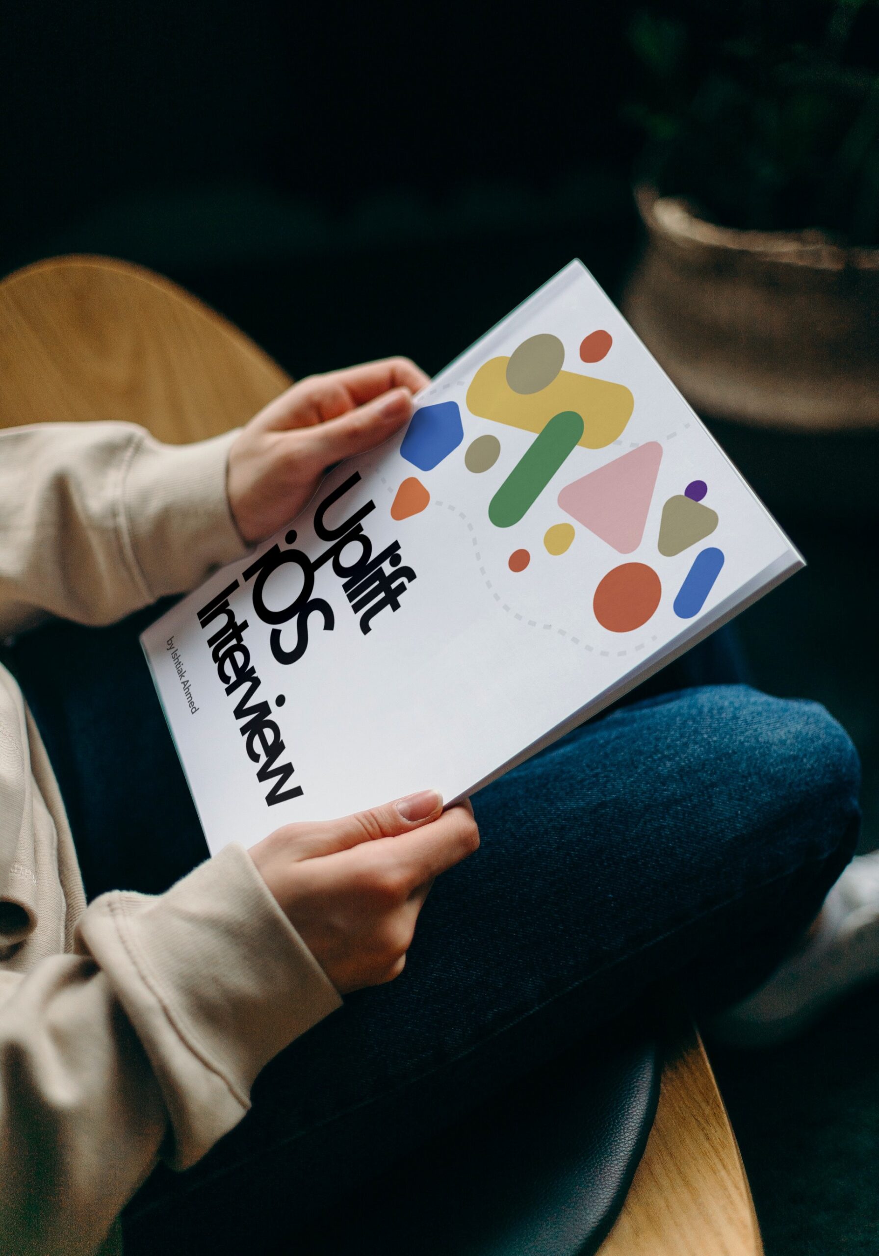
Uplift iOS Interview
The Guide is for YOU if
- You are preparing for an iOS interview and want to improve your skills and knowledge and looking to level up your interview game and land your dream job.
- You want to gain confidence and ease during iOS interviews by learning expert tips and curated strategies.
- You want access to a comprehensive list of iOS interview QA to practice and prepare.
Glassmorphism is a popular design trend which provides stunning UI and UX for the user. You can find glassmorphic UI everywhere in apple’s design.
The most common way to achieve glassmorphic UI is by adding blur to the background, adding inner shadow, drop shadow as well as highlighting the border. After adding the blur effect whatever is behind the background is beautifully “morphed” into the element itself. Glassmorphic UI item really shines while using vividly coloured background.
A glassmorphic card is a design pattern that involves creating a transparent card with a reflection effect, similar to the look of a sheet of glass. To implement a glassmorphic card in SwiftUI, you can use the Card view provided by the SwiftUI framework and customize its appearance with the background(_:) and cornerRadius(_:) modifiers.
Here’s an example of how to create a glassmorphic card in SwiftUI:
struct GlassmorphicCard<Content>: View where Content: View {
  let content: Content

  var body: some View {
    Card {
      content
    }
    .background(Color.clear)
    .cornerRadius(12)
    .shadow(color: Color.black.opacity(0.2), radius: 8, x: 0, y: 4)
  }
}
In this example, the GlassmorphicCard view is a generic view that takes a Content parameter and displays it within a Card view. The background(_:) modifier is used to set the background color of the card to clear, which makes the card transparent. The cornerRadius(_:) modifier is used to round the corners of the card, and the shadow(color:radius:x:y:) modifier is used to add a drop shadow to the card to create the reflection effect.
To use the GlassmorphicCard view, you can pass it a view component as the Content parameter. This will create a transparent card with rounded corners and a reflection effect, containing the text “Hello, World!”. You can customize the appearance of the card further by adding additional modifiers or using custom styles. For example:
GlassmorphicCard {
  Text("Hello, World!")
}
✍️ Written by Ishtiak Ahmed
👉 Follow me on X ● LinkedIn
Get Ready to Shine: Mastering the iOS Interview
Enjoying the articles? Get the inside scoop by subscribing to my newsletter.
Get access to exclusive iOS development tips, tricks, and insights when you subscribe to my newsletter. You'll also receive links to new articles, app development ideas, and an interview preparation mini book.