

Uplift iOS Interview
The Guide is for YOU if
- You are preparing for an iOS interview and want to improve your skills and knowledge and looking to level up your interview game and land your dream job.
- You want to gain confidence and ease during iOS interviews by learning expert tips and curated strategies.
- You want access to a comprehensive list of iOS interview QA to practice and prepare.
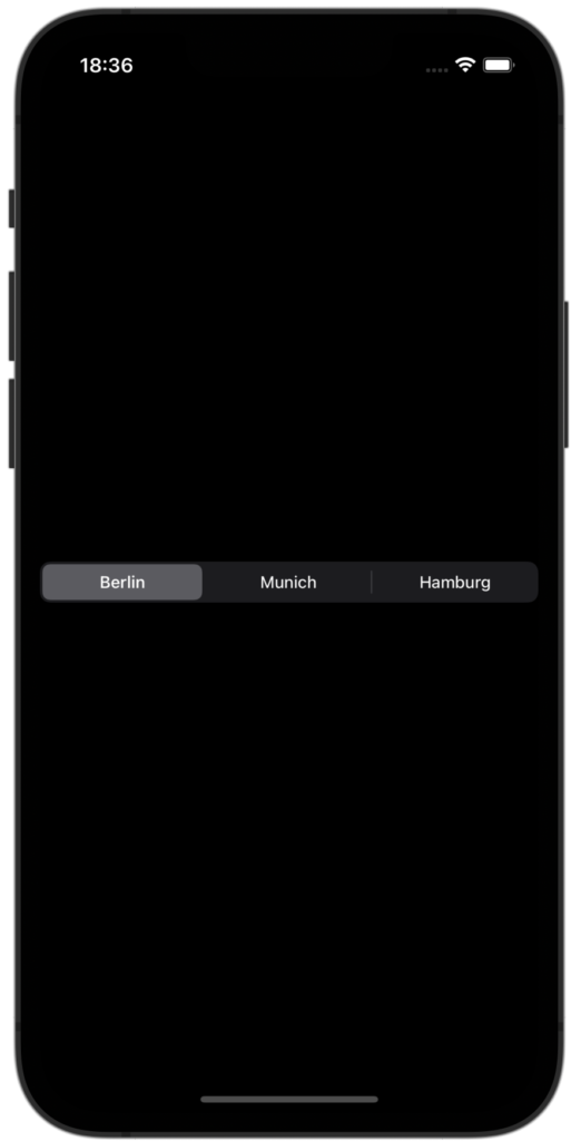
The segmented control in iOS is like a selection bar with two or more segments, each of which works as a mutually exclusive segment/button. In this super short tutorial, we will take a look SwiftUI provided segmented control as well as a custom segmented control.
Native segmented control uses picker with SegmentedPickerStyle to create a segmented control view.
struct ContentView : View {
    @State private var preselectedIndex = 0
    @State private var cities = ["Berlin", "Munich", "Hamburg"]

    var body: some View {
        VStack {
            Picker("City", selection: $preselectedIndex) {
                ForEach(0..<cities.count) { index in
                    Text(cities[index])
                        .tag(index)
                }
            }
            .pickerStyle(SegmentedPickerStyle())
        }
    }
}
Get ahead of the competition and ace your next iOS interview with expert-curated resources. Check out the collection of SwiftUI and Swift interview questions and answers, behavioral interview tips, and the popular custom layout contents. Plus, go through the new section for Engineering Manager to help you excel in your career!
Join my free Newsletter 🚀
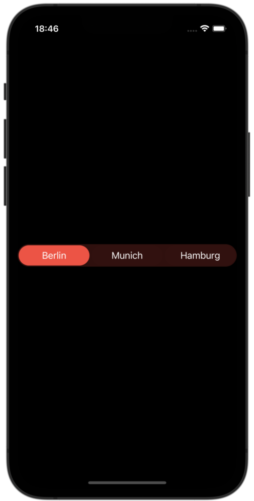
Now let’s try to implement custom segment control using ZStack and some rectangles. I am using a foreach to loop through all options. Inside the ZStack, first rectangle is used for background color and second rectangle is used for selection color. Segment title is added inside the overlay.
struct CustomSegmentedControl: View {
    @Binding var preselectedIndex: Int
    var options: [String]
    let color = Color.red

    var body: some View {
        HStack(spacing: 0) {
            ForEach(options.indices, id:\.self) { index in
                ZStack {
                    Rectangle()
                        .fill(color.opacity(0.2))

                    Rectangle()
                        .fill(color)
                        .cornerRadius(20)
                        .padding(2)
                        .opacity(preselectedIndex == index ? 1 : 0.01)
                        .onTapGesture {
                                withAnimation(.interactiveSpring()) {
                                    preselectedIndex = index
                                }
                            }
                }
                .overlay(
                    Text(options[index])
                )
            }
        }
        .frame(height: 40)
        .cornerRadius(20)
    }
}
You can use this as a separate component and change the color based on your style. Calling this component is super easy from your main content view.
struct ContentView: View {
    @State var preselectedIndex = 0

    var body: some View {
        CustomSegmentedControl(preselectedIndex: $preselectedIndex, options: ["Berlin", "Munich", "Hamburg"])
    }
}
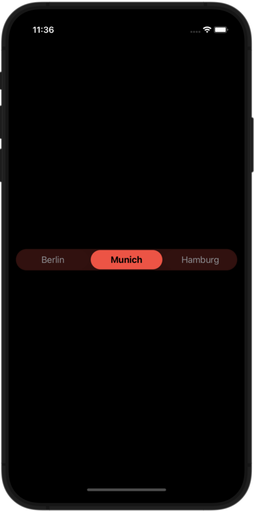
Though the following implementation is enough for basic use, let’s enhance the UI and code a little by adding some extra properties.
struct CustomSegmentedControl: View {
    @Binding var preselectedIndex: Int
    var options: [String]
    let color = Color.red

    var body: some View {
        HStack(spacing: 0) {
            ForEach(options.indices, id:\.self) { index in
                let isSelected = preselectedIndex == index
                ZStack {
                    Rectangle()
                        .fill(color.opacity(0.2))

                    Rectangle()
                        .fill(color)
                        .cornerRadius(20)
                        .padding(2)
                        .opacity(isSelected ? 1 : 0.01)
                        .onTapGesture {
                            withAnimation(.interactiveSpring(response: 0.2,
                                                             dampingFraction: 2,
                                                             blendDuration: 0.5)) {
                                preselectedIndex = index
                            }
                        }
                }
                .overlay(
                    Text(options[index])
                        .fontWeight(isSelected ? .bold : .regular)
                        .foregroundColor(isSelected ? .black : .gray)
                )
            }
        }
        .frame(height: 40)
        .cornerRadius(20)
    }
}
You can also use the Button and Text to create the same kind of segment control.
struct AnotherCustomSegmentedControl: View {
    @Binding var selectedSegment: Int
    var segments: [String]
    let color = Color.red

    var body: some View {
        HStack(spacing: 10) {
            ForEach(segments.indices, id:\.self) { index in
                Button(action: {
                    withAnimation(.interactiveSpring()) {
                        selectedSegment = index
                    }
                }) {
                    Text(segments[index])
                        .font(.system(size: 12))
                        .padding(.vertical, 10)
                        .padding(.horizontal, 20)
                        .background(color.opacity(0.8))
                        .cornerRadius(10)
                }
                .foregroundColor(.white)
                .opacity(selectedSegment == index ? 1 : 0.5)
            }
        }
    }
}

struct ContentView: View {
    @State private var selectedSegment = 0

    var body: some View {
        VStack {
            AnotherCustomSegmentedControl(
                selectedSegment: $selectedSegment,
                segments: ["Segment 1", "Segment 2", "Segment 3"]
            )
            Text("Selected segment: \(selectedSegment)")
        }
    }
}
This control displays a horizontal stack of buttons, with each button representing a segment of the control. The selectedSegment binding is used to keep track of the currently selected segment, and the segments array specifies the labels for each segment. The control uses an interactive spring animation when the selected segment is changed.
To use this control in your code, you would need to create a binding to a state variable that will hold the selected segment index, and pass it to the selectedSegment property of the control. You would also need to provide an array of segment labels as the segments property.
Planning to apply for an iOS job? Check out this article to uplift your resume! Also helpful – SwiftUI and Swift Interview preparation. Happy job hunting!
✍️ Written by Ishtiak Ahmed
👉 Follow me on X ● LinkedIn
Get Ready to Shine: Mastering the iOS Interview
Enjoying the articles? Get the inside scoop by subscribing to my newsletter.
Get access to exclusive iOS development tips, tricks, and insights when you subscribe to my newsletter. You'll also receive links to new articles, app development ideas, and an interview preparation mini book.